An Omnichannel Campaign to Counter the Competition
Company
Alight
The Challenge
A well-funded rival platform took a public shot at Alight, the kind that gets forwarded around a leadership team within the hour. The stakes were real: the competitor was bidding on Alight's own brand keywords in paid search and actively soliciting 20 of our existing clients, direct pressure on $100M in recurring revenue. Demand Gen and Field Marketing were completely underwater at the time, so the CMO came straight to my team. Our CEO wanted a response campaign, and he wanted it fast.
The brief was simple to say and hard to do: build something that answered the jab directly, made Alight's case on the merits, and didn't read like we were rattled. (Bonus points if we could reuse it for other takeout campaigns in the future.)
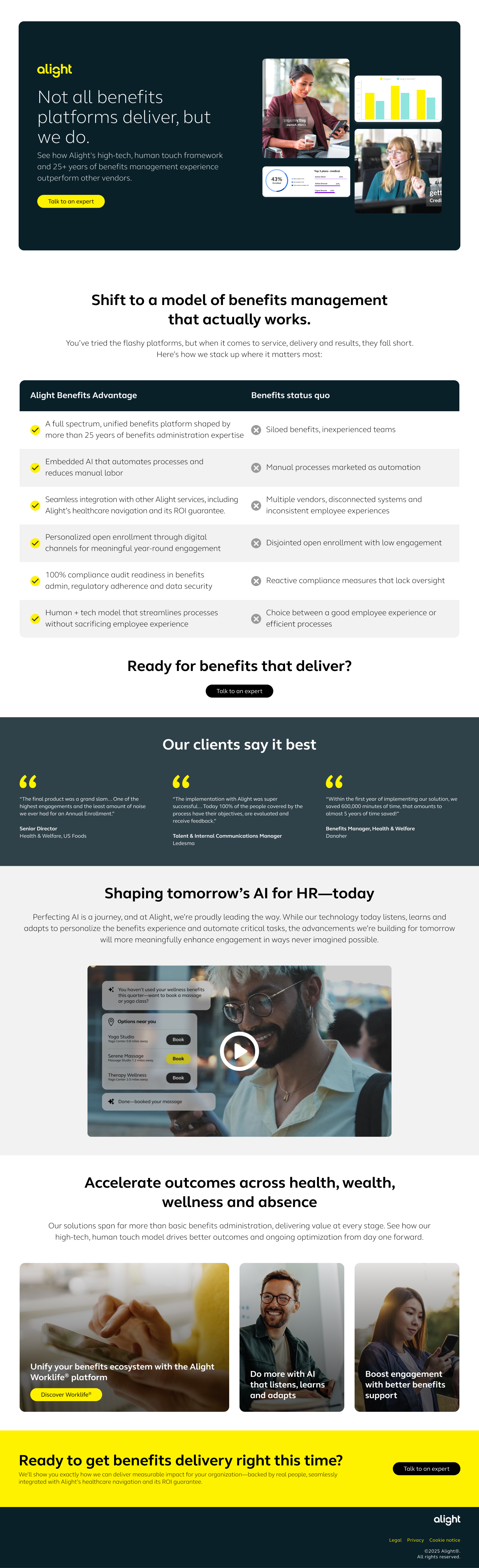
Landing Page
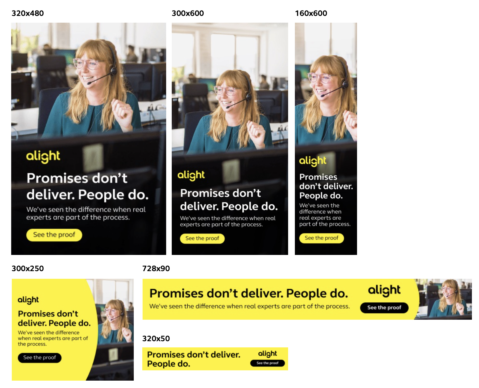
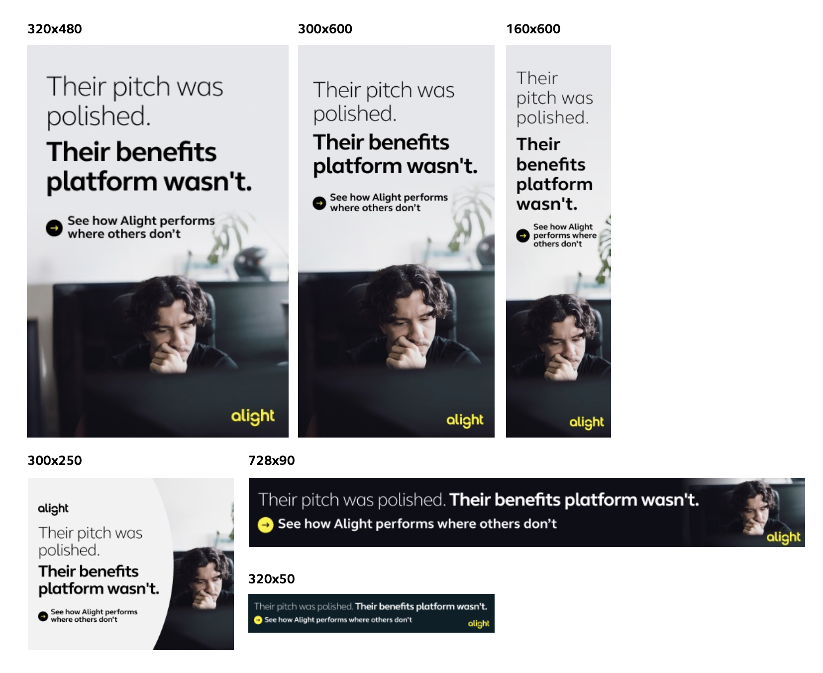
Display Ads (6Sense)
Varient A
Varient B
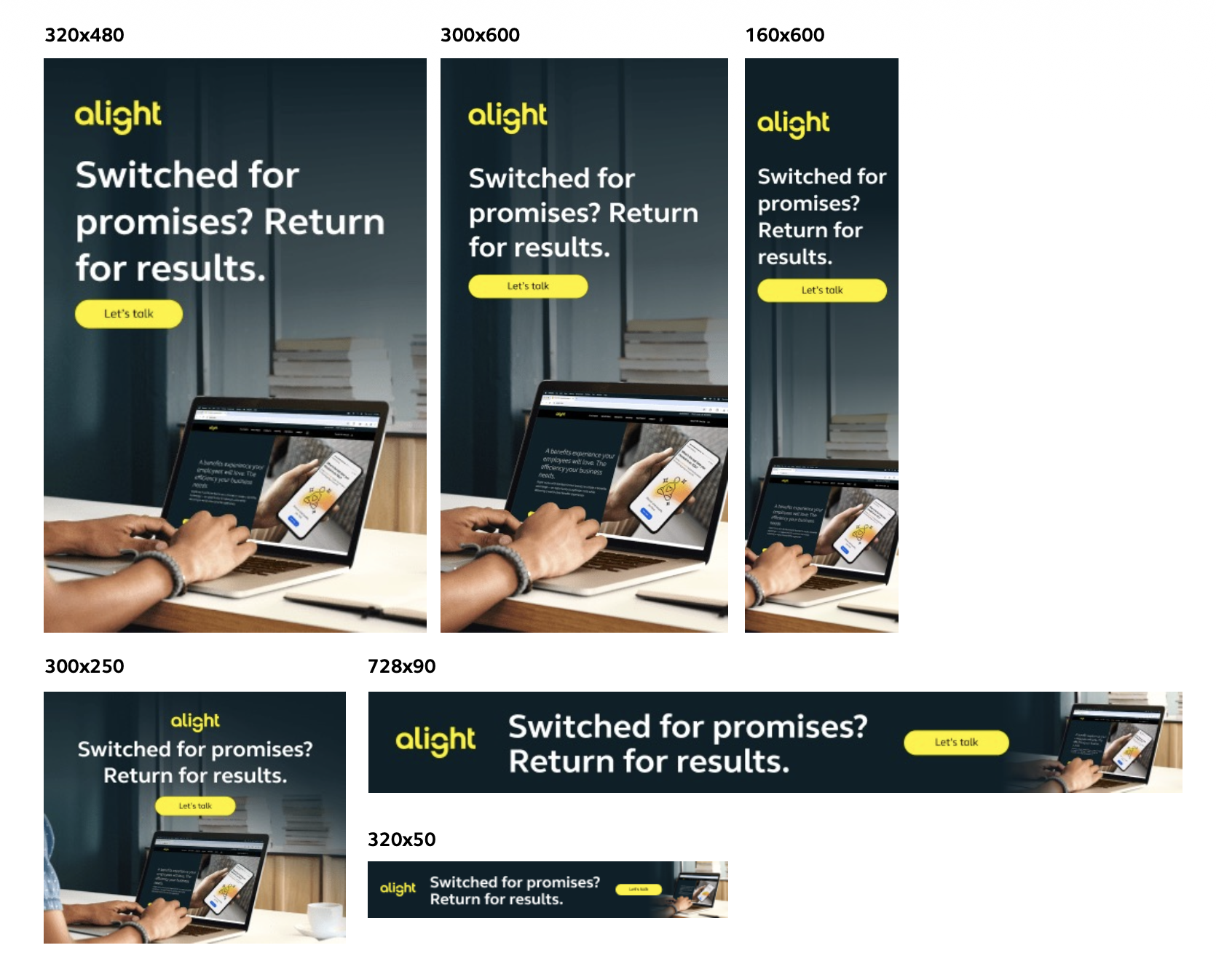
Varient C
-
My team owned the project end to end - strategy, copy, design, the whole build and did it in less than two weeks. We wrote the landing page first, because that's where the argument actually had to land: a direct, point-by-point comparison of what Alight delivers against what the status quo actually looks like.
Everything else, the display ads, the organic posts, the paid social, existed to drive people there.We skipped email on purpose because it wasn’t a nurture campaign, but a public statement.
That meant real proof points instead of claims, and a tone that read as confident rather than defensive.
-
I set the strategic direction (the comparison-table approach, the whole shape of the argument) and took the first pass at the landing page and ad copy myself. From there I handed it to our copywriter to finesse and sharpen.
I worked alongside a small, brilliant collection of my team: a Lead Developer, a Sr. Digital Designer, a UX/UI Director, and that copywriter. I leaned on our UX/UI Director's read on the page before we built anything, and our Sr. Digital Designer and Lead Developer turned the landing page and ads around in record time.
What this
work changed
The campaign held up on strategy, on message, and on execution, in front of our CMO and CEO. That combination changed how our creative team was seen inside Alight.
We stopped being the group that made things look good after the strategy was already set, and started being the group in the room while the strategy was still being built … a genuine in-house agency, not an order-taking print shop.
Our team started sitting down regularly with Demand Gen and Digital Marketing to talk through how they built their campaigns from the ground up. One of those conversations turned into a real discovery: the data showed that 50% of won deals had attended two or more webinars. That single insight reframed a goal, from just chasing new business, to also accelerating deals already in the RFP process by getting more prospects into webinars.